We will talk about the widgets we use while designing our screen in Flutter in general, and their features and usage areas. In other words, we can say that they are structures where we adjust how we place our elements, such as a little alignment and button/image. It may also be the bone structure. We will cover page design, widget design and features.
Center
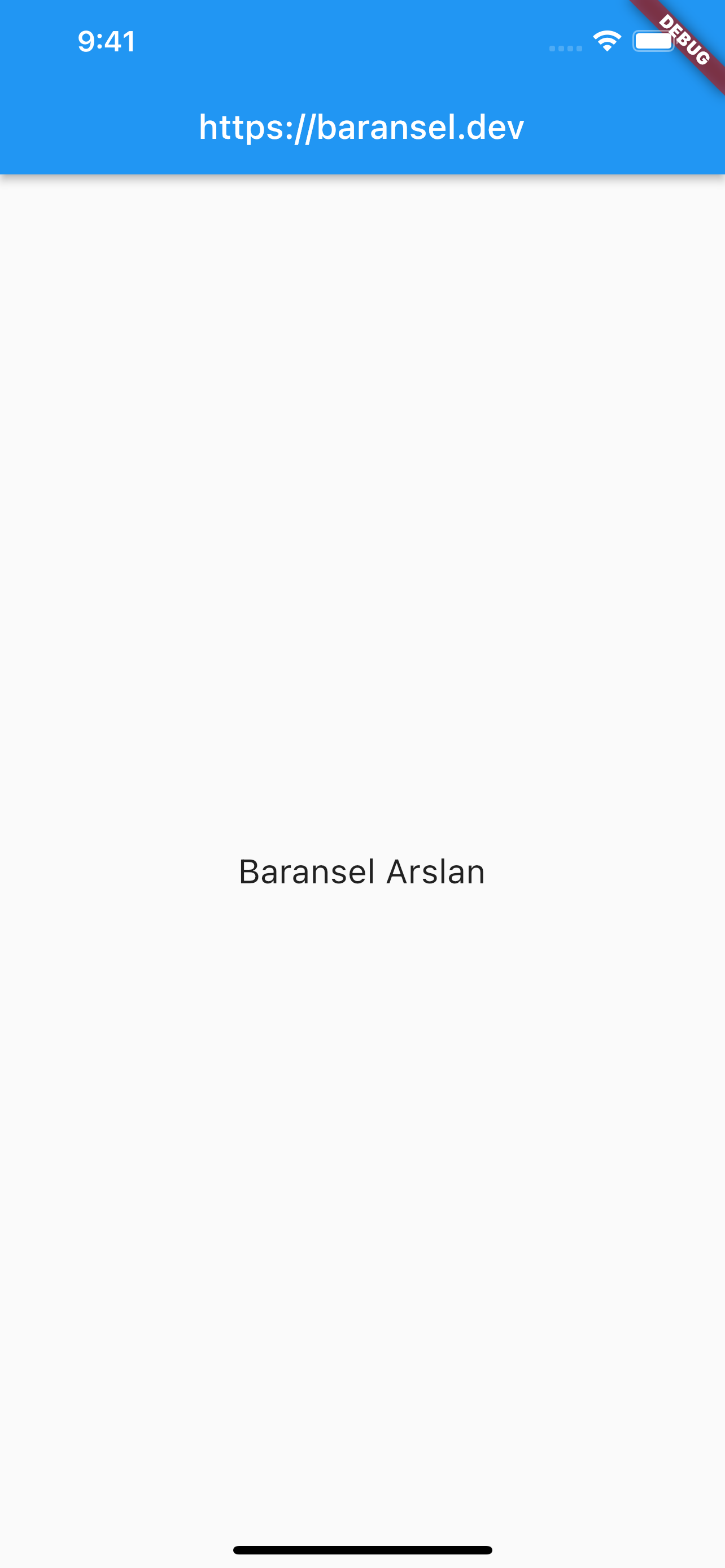
First, we can start with the Center widget. Center widget means align center. It places the enclosed element in the center of the screen. And since the Center widget can only have one widget, it uses child.
As an example, you can try writing the code and how it looks like below:
const Center(
        child: Text(
          "Baransel Arslan",
          style: TextStyle(fontSize: 20),
        ),
      )
If you write the code in the body part of Scaffold, we can notice that the Text widget it contains is located in the center of the page, as we can see below.
Container
Container is also similar in the meaning of the word. We can think of this widget as a box. So we imagine we are building our page inside a box. Container draws us a box, and we can change the properties of this box ourselves. Container widget also uses child as it can only take one widget.
Now we will look at the properties of the Container by creating the Container widget inside the Center we learned above. We could use the whole page directly as a box without writing it into the Center, so we could write Container directly in the body part. In these examples, we only aim to make it easier to view better if it is in the center of the page.
Center(
        child: Container(
          child: Text(
            "Baransel Arslan",
            style: TextStyle(fontSize: 20),
          ),
        ),
      )
In this way, if we place only the Text widget inside the Container, its appearance will not change, and it will be like the following:
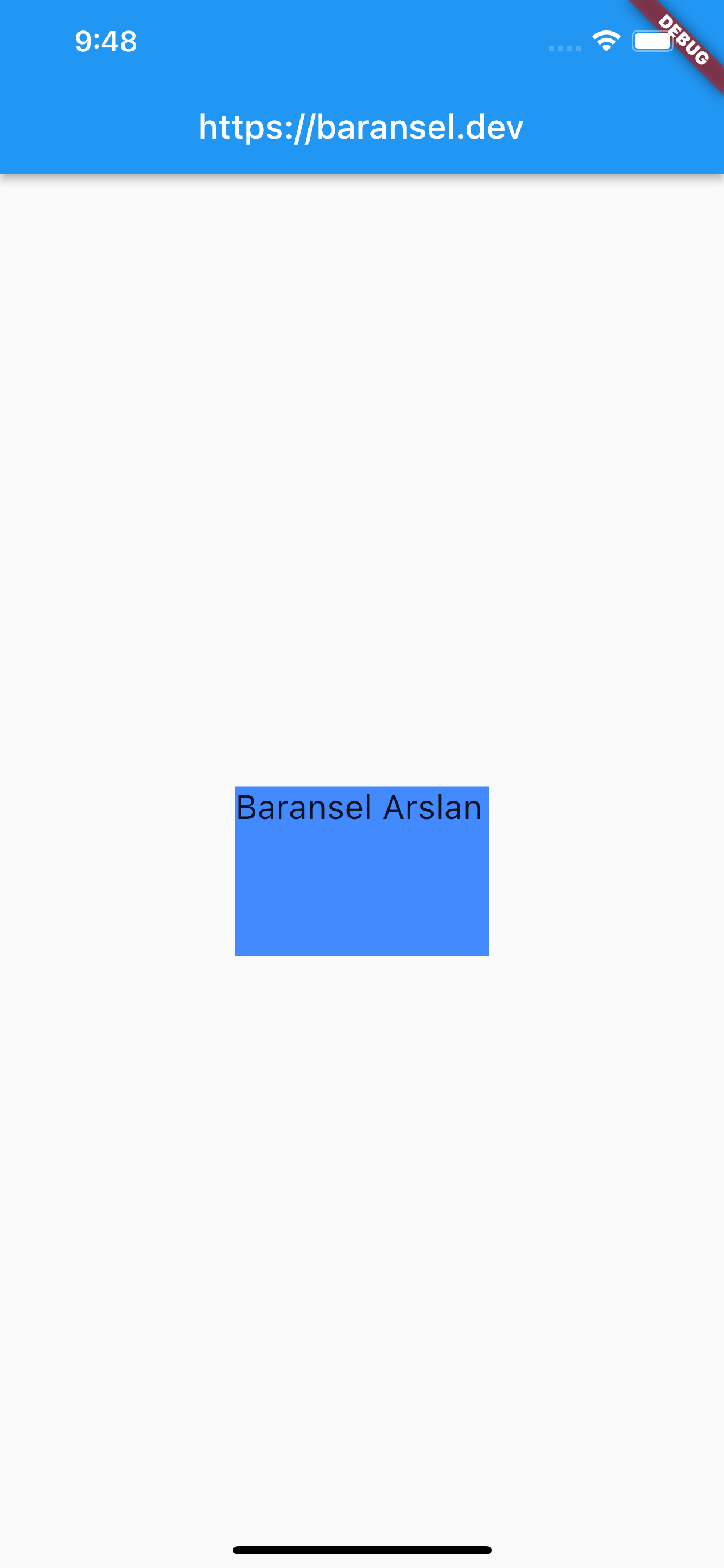
Center(
        child: Container(
          width: 150,
          height: 100,
          color: Colors.blueAccent,
          child: Text(
            "Baransel Arslan",
            style: TextStyle(fontSize: 20),
          ),
        ),
      )
By giving some properties to the container we get the following image. We determine the width with the width, and the height with the height ourselves. After that, we can choose the color we want, for the background.
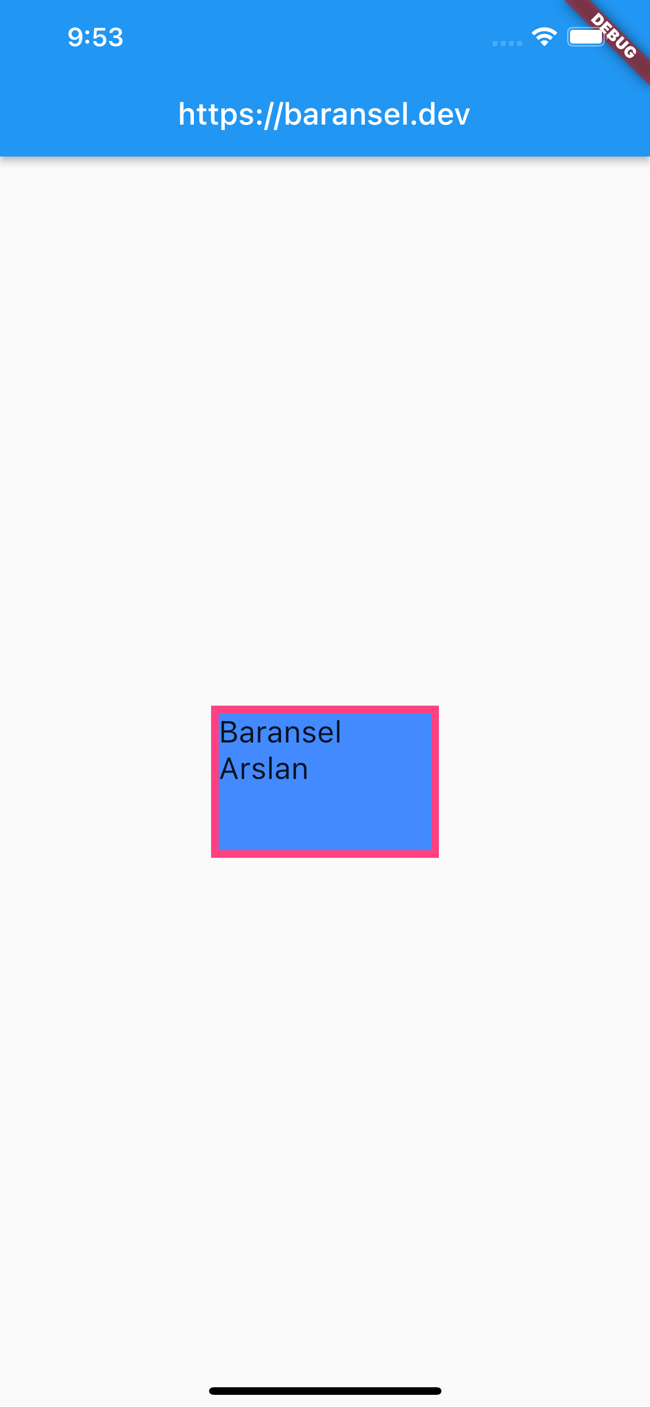
Center(
        child: Container(
          width: 150,
          height: 100,
          decoration: BoxDecoration(
            color: Colors.blueAccent,
            border: Border.all(color: Colors.pinkAccent, width: 5),
          ),
          child: const Text(
            "Baransel Arslan",
            style: TextStyle(fontSize: 20),
          ),
        ),
      )
If we want to play with the edges of the Container widget we have created, we use the decoration: BoxDecoration() property. If we use decoration: BoxDecoration(), we need to define the color inside it. Because when defining its edges, it wants us to define it here because the color property is inside the edges.
If we want the edges to be prominent, we use border. By typing border: Border.all(), all the edges will be lined. But if we want to customize it even more, by getting into this; We can determine the thickness of the line with = width, color = color. As in the sample code and its output is as follows:
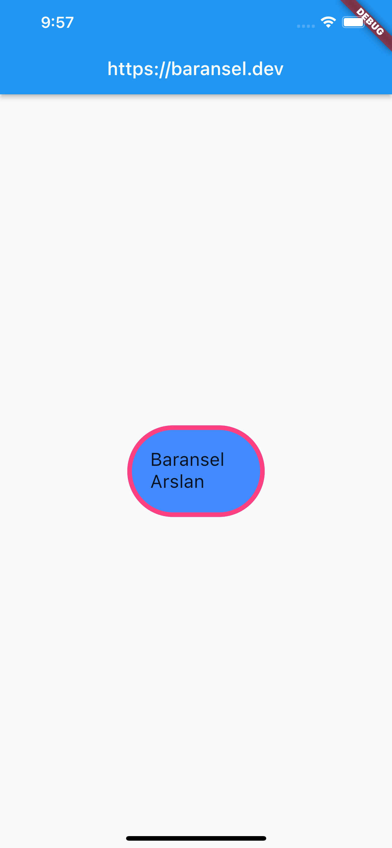
Center(
        child: Container(
          width: 150,
          height: 100,
          decoration: BoxDecoration(
              color: Colors.blueAccent,
              border: Border.all(color: Colors.pinkAccent, width: 5),
              borderRadius: const BorderRadius.all(Radius.circular(50))),
          child: const Padding(
            padding: EdgeInsets.all(20.0),
            child: Text(
              "Baransel Arslan",
              style: TextStyle(fontSize: 20),
            ),
          ),
        ),
      )
So what if we want the edges to be slightly curved rather than pointed? Here, we will use the decoration: BoxDecoration() property, which we used to customize the edges. By typing borderRadius: const BorderRadius.all(Radius.circular(50))) inside this function, we can specify how much of its edges are curled.
Padding
In this code, while playing with the edges of the Container widget, we have included it in Padding() so that the Text widget inside it will look nice, so we put a distance around it.
With EdgeInsets.all(10) we put the same degree of distance from all edges.
With EdgeInsets.only(right: 5) we only give the offset to the right side as an example. So we only use it for distance from one side, it doesn’t matter right/left/top/bottom.
With EdgeInsets.fromLTRB(5, 10, 15, 20), we can assign a different value to each vertex, L= left, T = top, R = right, B = bottom, respectively.
With EdgeInsets.symmetric(vertical: 5) / EdgeInsets.symmetric(horizontal: 5) we can only assign distance symmetrically.
Row
We control the column with the Row widget. That is, if we use the Row widget, the widgets we will add are aligned side by side. So we can think column by column. Naturally, we use children because it takes more than one widget.
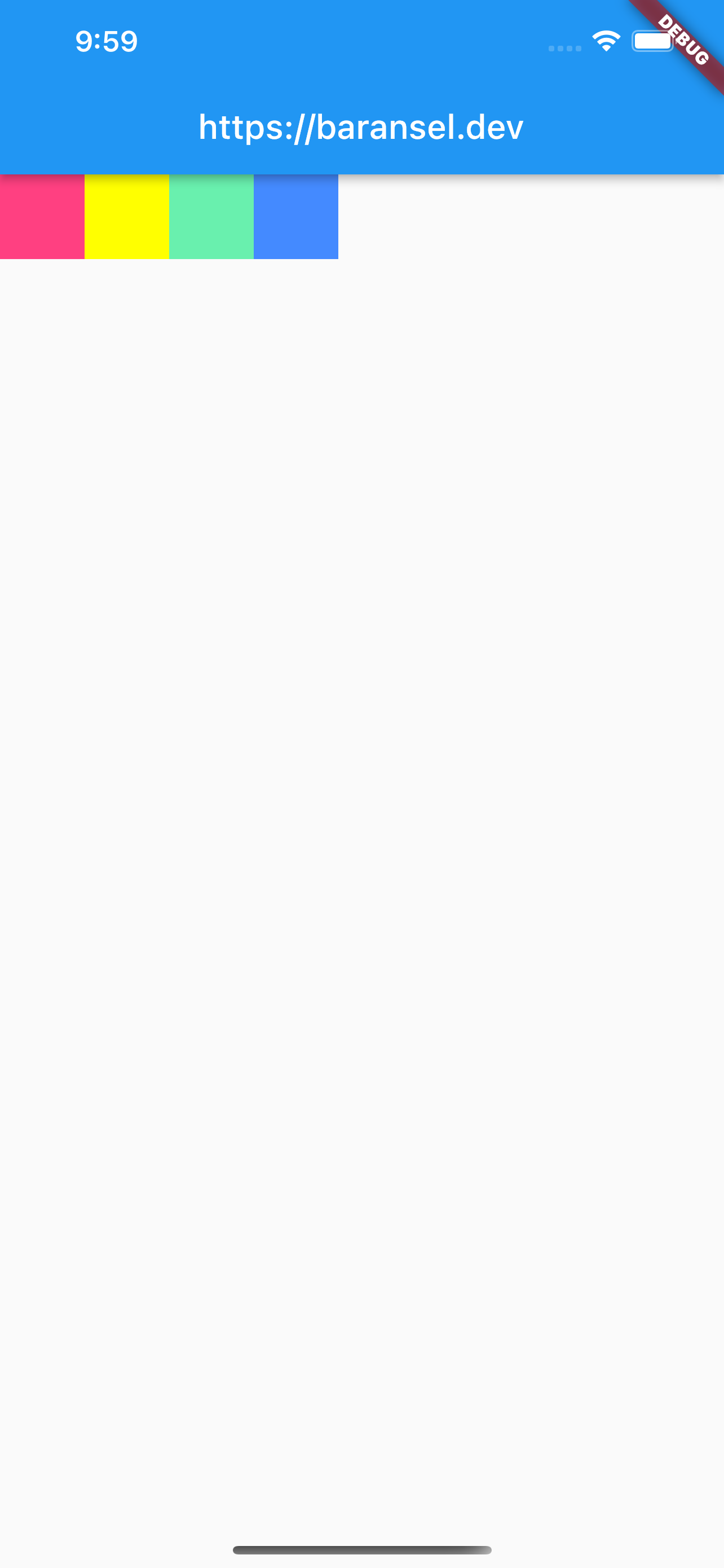
As an example of its use, we can immediately try the following code:
Row(
        children: <Widget>[
          Container(
            width: 50,
            height: 50,
            color: Colors.pinkAccent,
          ),
          Container(
            width: 50,
            height: 50,
            color: Colors.yellowAccent,
          ),
          Container(
            width: 50,
            height: 50,
            color: Colors.greenAccent,
          ),
          Container(
            width: 50,
            height: 50,
            color: Colors.blueAccent,
          )
        ],
      )
When adding multiple widgets, do not forget to put commas between them.
The output will be like this:
So how can we control the alignment of widgets in this? So it has to be stuck together and on the left side of the page? Of course no. Here, we go into the properties of Row.
mainAxisAligment: MainAxisAligment.start(starts aligning with reference to origin)mainAxisAligment: MainAxisAligment.center(center aligns)mainAxisAligment: MainAxisAligment.end(aligns in the end)mainAxisAligment: MainAxisAligment.spaceBetween(alignment with equal distance between them without leading and trailing spaces)mainAxisAligment: MainAxisAligment.spaceEvenly(aligning by spreading on the line, placing equal distance between them)
Column
We also manage rows with the Column widget. In other words, the widgets we add inside are aligned one below the other. So we can think of it line by line. We use children since the Column widget is also convenient to have more than one widget.
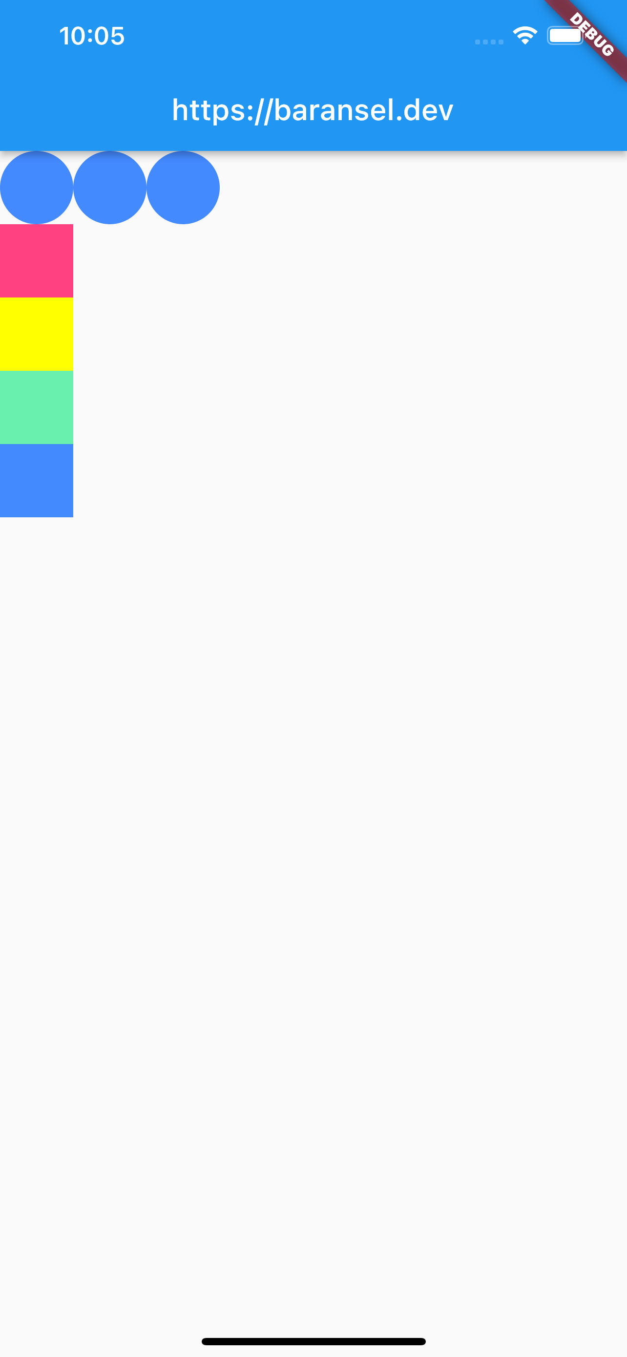
As an example of its use, we can try the following code:
Column(
        crossAxisAlignment: CrossAxisAlignment.start,
        children: <Widget>[
          Row(
            children: <Widget>[
              Container(
                width: 50,
                height: 50,
                decoration: const BoxDecoration(
                    color: Colors.blueAccent,
                    borderRadius: BorderRadius.all(Radius.circular(50))),
              ),
              Container(
                width: 50,
                height: 50,
                decoration: const BoxDecoration(
                    color: Colors.blueAccent,
                    borderRadius: BorderRadius.all(Radius.circular(50))),
              ),
              Container(
                width: 50,
                height: 50,
                decoration: const BoxDecoration(
                    color: Colors.blueAccent,
                    borderRadius: BorderRadius.all(Radius.circular(50))),
              ),
            ],
          ),
          Container(
            width: 50,
            height: 50,
            color: Colors.pinkAccent,
          ),
          Container(
            width: 50,
            height: 50,
            color: Colors.yellowAccent,
          ),
          Container(
            width: 50,
            height: 50,
            color: Colors.greenAccent,
          ),
          Container(
            width: 50,
            height: 50,
            color: Colors.blueAccent,
          )
        ],
      )
In the Column widget we created: we added a Row to the first row and a Container widget to the other rows and completed it to 5 rows. As we know in Flutter, we can add widgets inside widgets. Thus, we can design the page as we want very easily.
Also, if you noticed here we used crossAxisAligment to align in Column widget. Its output is as follows:
Column and Row widgets have similar features. Only in the widgets they enclose, the alignment directions gain change. mainAxisAlignment can be x-axis in Row; It is the y-axis in the column. In crossAxisAlignment, while Row is the y-axis; In column it is the x-axis.