We will talk about the most used Flutter button types and their features. When developing an application with Flutter, we can start with the example that comes up when we first open it. With the button placed in the lower right corner of the screen, we +1 to the number in the center of the screen as it is clicked. Actually, the button type used in this example is called Floating Action Button.
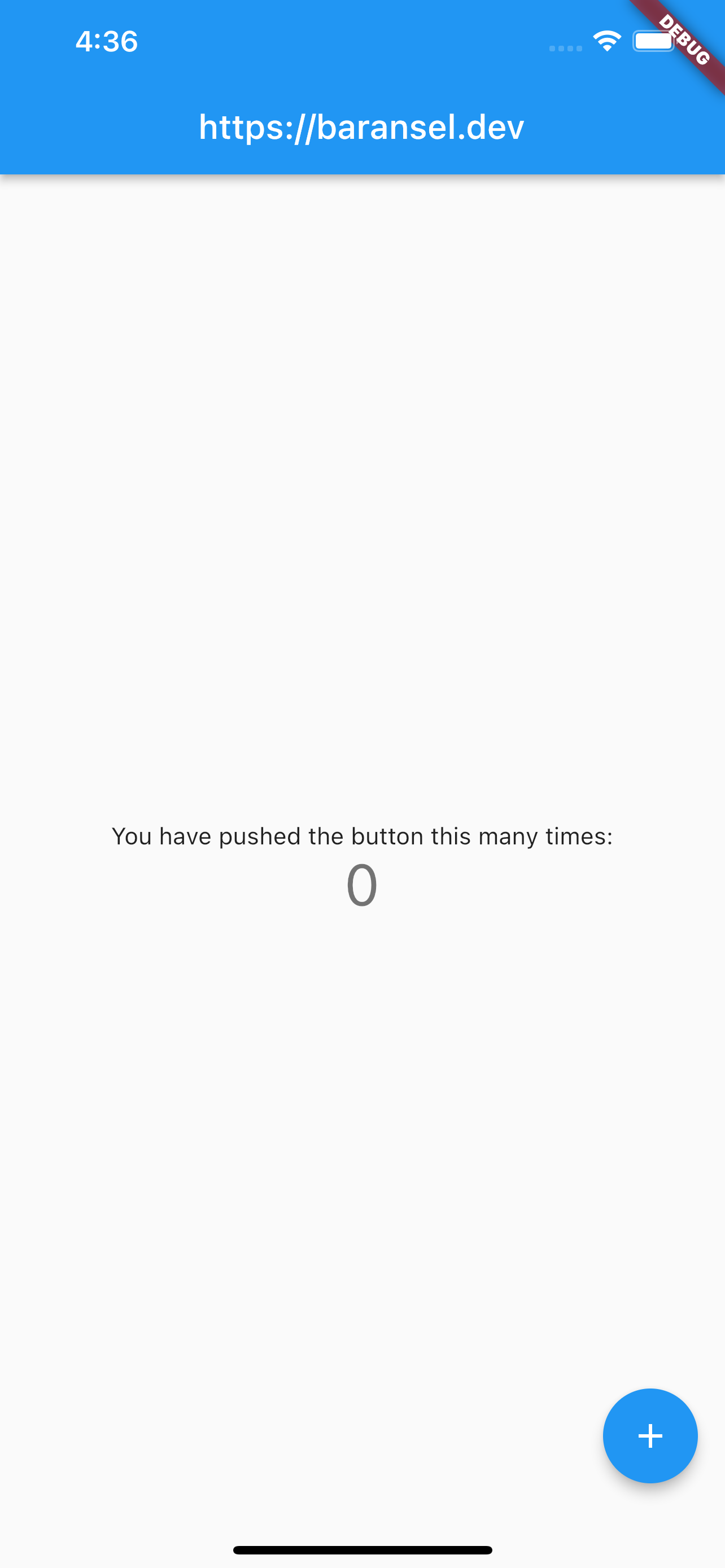
Floating Action Button
Different from other buttons, it can be used outside the body in Scaffold. If used outside the body, we start with a lowercase letter and its position is automatically the bottom right corner of the screen. For instance,
floatingActionButton: FloatingActionButton(
  onPressed: _incrementCounter,
  tooltip: 'Increment',
  child: const Icon(Icons.add),
),
If we use it inside the body, we can do the positioning as we want. This time, we start with a capital letter.
It uses child because all buttons can take a single widget. We can add any widget we want to them. Let’s go through the codes and examine the features of the Floating Action Button.
floatingActionButton: FloatingActionButton(
  splashColor: Colors.blueAccent,
  backgroundColor: Colors.redAccent,
  onPressed: () {
    debugPrint("Button clicked!");
  },
  tooltip: 'Increment',
  child: const Icon(Icons.add),
),
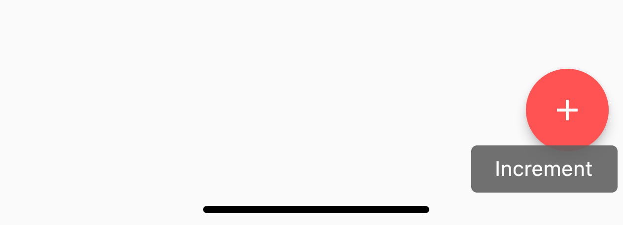
When we examine the code above, we can see that we have placed the icon widget inside our button widget. When changing the background color with the backgroundColor; While holding down the button, we can determine the color with splashColor. The tooltip is the part that gives us information, when we keep the button pressed, it is reflected on the screen for a short time, as we see in the picture. With onPressed, we give the click feature.
floatingActionButtonLocation: FloatingActionButtonLocation.centerDocked,
Inside the Scaffold, outside the body, with the above code; We can position the Floating Action Button to the center.
floatingActionButton: FloatingActionButton(
  backgroundColor: Colors.pinkAccent,
  onPressed: () {
    debugPrint("Button clicked!");
  },
  shape: RoundedRectangleBorder(borderRadius: BorderRadius.circular(5)),
  tooltip: 'Increment',
  child: const Icon(Icons.insert_emoticon),
)
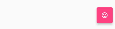
So, is the Floating Action Button always round? No, we can shape it as we want with shape, just like in the picture.
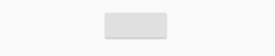
Raised Button
Raised Button is one of the most classic buttons. Even if we do not write anything in this widget we have created, a gray rectangular button will appear by default, just like the one below.
It has the same features as other buttons. I would just like to point out that we cannot change its color without giving it the click attribute. If we do not write the onPressed() method, we cannot see it no matter how many colors we give it.
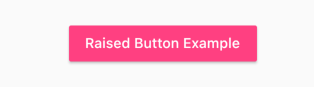
RaisedButton(
  color: Colors.pinkAccent,
  child: const Text(
    "Raised Button Example",
    style: TextStyle(color: Colors.white),
  ),
  onPressed: () {
    debugPrint("Button clicked!");
  },
),
We can give general properties such as splash or shape to the Raised Button.
Icon Button
Icon button, like its name, is a widget that we can create a button with just an icon. In this button, we play more with icon features. Unlike, it does not include any other widgets. First, let’s examine our buttons that appear below. Since we only selected the icon, the splash feature, that is, the color that occurs in the background when pressing the button, is gray.
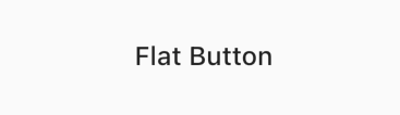
Flat Button
A flat button is a button type that is shaped according to the widget it will contain. So, if we add the Text widget to it, only text will appear, and we can use it as a button as we want. Just like below,
FlatButton(
  onPressed: () {},
  child: const Text(
    "Flat Button",
    style: TextStyle(fontSize: 24),
  ),
),